Monday, 7 November 2011

Crit Feedback

I need to decide which route I want to go down after the crit today. Nan Goldin pretends she is a fly on the wall when realistically, why would anyone let someone photograph them shagging if they didn't know she was there and so on..? She has to put herself in these shocking positions and find situations where she is welcome. 
Do I want to go down the route like Diane A where people can look at the camera and engage or do I want to do a Goldin and be anonymous? How shocking do I want the images to be? I could explore much more intimate imagery with Sam to show how strong the relationship between the subject and the photographer is. I couls also shoot from strange angles like I am looking down on the subject or through a window and so on to become that fly on the wall. 

Artists to look at - 
Nan Goldin 
Diane A
Richard Billingham.
Crit November 7th 2011

The images are a way of exploring the lives of the people around me. I wanted to follow them and see what their reality is. How they live their lives day to day. I looked at the way Nadar started to document people and the way Nan Goldin photographed the vast cultures around her in a completely different light. She used a much more documentary type technique to create her portraits where Nadar didn't have these options and simply took portraiture for a documenting level to a fine art level. I wanted to meet in the middle of these two photographers as I don't want my images to represent documentation but I don't want them to just ooze shock value. They are there to explore the lives of my friends, family and maybe strangers to illustrate their lives, personalities and the people they are to the world. 

Friday, 4 November 2011


A few of my favourite landscape images so far from the current project 'Reality'.
Following the young man around I capturing more scenes from his everyday life to try and connect with him and figure out what kind of person he is. 
This subject of reality has really got me stumped. What is reality? In our tutorials people are going on and on and philosophy and a load of other crap. I'm simply following this young man (my boyfriend ssshhh) and capturing his reality in a documenting format. Quite literally by capturing every angle of the specimen before I begin. I'm shooting in colour on 35mm then processing and printing myself in the snazzy colour darkroom at London College of Communication (I'm learning fast).
A few images exploring reality. I chose to be real simple about the whole thing. I'm now at University of The Arts London and the game has got much harder so I'm sticking to what I know for now. Portraiture & fashion. It's my first crit on Monday and to be honest I have done very little. It's a lot different being in now and again compared to last year when I was in every day!

Tuesday, 21 June 2011


Orrell Water Park

I have presented two images from this shoot as my final two. The weather was not particularly great which made it difficult to capture images that wouldn't need much edited as I am completely against serious editing. I think the two images above contrast extremely well together. In the left image the model is innocently depcited almost as a bride in the white dress that she is wearing. With the calm lake behind her it creates a sense of tranquility and innocence that suits her pose and her facial emotion and expression perfectly. In the image on the right it is much more fierce with the attire she is wearing that is almost skin tight you get a kind of amazon feel as if she were a native in some kind of jungle. The way her hair falls back creates a beautiful drape down to her arm. The very dark background covered in leaves in very different and much more wild than the calm lake which shows how much you can achieve from one location.


Here I have another four images from the Haigh Hall shoot but this time focusing on the cream dress. I found that this shot beautifully against the creamy wooden walls and doors and especially against the old floral wallpapers that were still covering the rooms. As the colours are naturally very de-saturated they look very dated but this is something I like about the images as it makes them a little more quirky. Again you have the very seductive nature of the imagery due to the very glamourous attire and the fact they seem to be dated which makes you think of Hollywood glamour which is wonderful.


Here are a few more images from the Haigh Hall shoot although these four are showing the blue dress which looks so vivid against the very grey surroundings. The material in the bottom of this dress looks amazing on camera because it's so delicate and rich and it brings an elegance to the images making the model just come across as completely fabulous. The glamour also brings the essence of seduction which is exaggerated by the doll like poses and the dark lips adding that little bit extra to the images.


My most recent shoot was at Haigh Hall, Haigh. We managed to get into the attic which is not open to the public after a lot of grovelling to the manager. After we explained exactly what we were doing and that we weren't going to exspose the notorious top floor of the hall to the newspapers he let us in. The rooms were incredible and just like the RAF base there was some fabulous natural light, unfortunately there wasn't as much as at the base but there was still a nice amount to play with.
The two images above are two of my favourite from the shoot and believe me I was lucky enough to find it very hard to narrow it down to a few favourite images. All in all the shoot was very successful as there was such an amazing contrast between the glamour of the dresses and the beautiful dying surroudings of the attics at Haigh Hall.


An image from Croft RAF base.
I visited with a friend who needed her work photographing and the images we came out with as a team were lovely. The lighting in the run down base is incredible. I have learned to LOVE natural light due to images like the one above where the light just falls beautifully through gaps in buildings and trees. Natural light was something I had avoided as I was obsessed with sticking to what I knew which was the studio and therefore the Bowen lights we have at college where my best friends. I find the light in this image just stunning to look at due to the symmetrical nature of the gaps in the wall and the way the light falls onto her head and down in a V shape. It's places like this old run down RAF base where you can find the most incredible natural light as the man made skeleton of the building is still intact and needs to be used for something.
As I have previously visited Croft in a previous unit many of the images are for her work rather than my own so I've only chosen a few to put into my sketchbook and present at the exhibition. This one above is my favourite from the series.


Thursday, 9 June 2011


(Click on seperate images to see movement)
These three cinemagraphs are amazing! They are exactly what I'm looking for for that extra special something in my exhibition. I love how they are just slightly moving, especially the effect of the hair as the hair looks stunning in slight movement.
As I'm travelling to Wales this weekend with my three models for inspiration and a change of scenery I'm going to try this out to see where it gets me.
As we are all approaching the final few days of AF the tension is getting HIGH! I've done some designs for my final exhibition digitally so I could have a better visual on what the imagery I am working with at the moment would look like. As I still have a few shoots to complete this weekend and the final one being on the deadline itself, next Wednesday, I need to be prepared on what sizes and what types of paper I want my images to be printed on to.
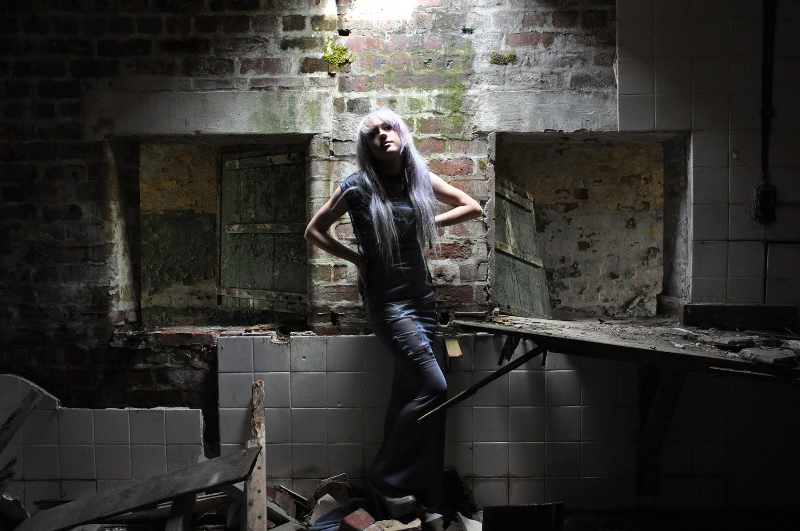
The problems I'm facing with my imagery at the moment is whether I want to use one model for all my images or have a mixture of models around the room. At the moment I have models, Ally Clark, Sam Lane, Jess Jones and Sally Lyon. I am much more fond of the Jess and Ally images although Ally is much more prominent in the images I have selected. The film I am using at the moment is simply the male model Sam. I'm not sure whether this will unbalance the exhibition or whether it even matters.
Although as I don't have all my imagery yet to work with I'm going to have to plan with what I've got and leave options for substitutes if I choose to make any next week. One thing I do know is that there will be a mixture of greyscale and colour photography which I can definitely not have on the same wall as they will clash in a very unflattering way. My plan as you can see previously is to have them on separate walls. I also want the room to be very dark so the film will create it's own light and I can have spotlights on each group or on each piece of still photography.
Whether or not I include the moving image is another problem I need to address over the next few days as I may not even need it in the final exhibition. Coming to a conclusion I know that I have the film ready to be put into my exhibition if I need it and if I decide to not to include it, it will be played on my blog during the show anyway.

Monday, 6 June 2011


Golden Girl
Model - Ally Clark
Fashion Design - India Blanchard.

These are my favourite four images from the shoot. The pictures are black and white because the dress simply looks stunning. It almost lights up as if it's made out of gold material.


Exploring the location.
Sefton Park
Models - Ally Clark, Jess Jones.
Fashion Designer and Stylist - India Blanchard.

Below are the first few images from the shoot at Sefton Park, Liverpool. Having the fashion designer with me on the shoot worked fabulously as we were able to work together to find areas on location that would complement the dresses. The dresses are partly made out of latex which is a material I had never had experience in photographing before and as it was a fashion shoot to advertise the attire I needed to learn how to work with it very quickly.
The few I have chosen here are from an area of Sefton Park where we played about in the grass to gain a selection of beauty shots of the two models separately and together. I shot with a vivid effect to pick up the very bright colours of the surroundings as I wanted them to contrast well with the two bright dresses instead of having the background fading away. The colour is something I have never really explored before either being a much more greyscale photographer, but in this instance I'm happy with the way they have turned out, adding a bit of colour to the rest of my work.


Thursday, 26 May 2011


Developing Ideas with the idea of abstraction.
Simply covering the face with a veil.

Tuesday, 24 May 2011


70 mph winds really didn't help me on this shoot at all. I wanted it to be windy but the beach at Formby was far to dangerous to film or use any kind of equipment bar my camera. She almost looks stencilled in because I dressed the model in a black dress to create a natural contrast.
MY previous shoot reminded me a lot of Arnulf Rainer's art where he paints over printer images.

I haven't named this set of four images. Using my lovely boyfriend once again I asked him to stand in the studio behind a wall of perspex and covered his face in white make up. I crushed up a very large amount of chalk and blew it onto the perspex to create abstract sections in the image where you can't see the face. I wanted him to blend into his surroundings to create the illusion of the way he was feeling. Coming up to the end of the year when everyone has an almost crippling amount of work to get done for deadlines you feel as if your head is going to explode. By merging him into the white background and creating these random sections of colour I've illustrated the way his ideas and his mind are everywhere and he can't keep control of his own stress and emotion.

Wednesday, 18 May 2011


Here are a few simple design ideas I've put together for my final piece before I find out exactly what size and shape my space will be for my final exhibition. All in all I am looking at using three or more television screens to play my short films or clips and then a selection of portraits on the wall presented as still photography rather than the moving image. I want music to be a huge part of my exhibition. Instead of people just going to have a look I want it to be a kind of experience where people are immersed in what is going on around them and I can push my thoughts feelings and ideas upon them without them even realising.

Stop Motion Four.
Here I have played around with the idea of using clothes while using the stop motion technique. Inspired by the Joost Vandebrug video. PRACTICE MAKES PERFECT! 

Stop Motion - Third Attempt
In this third attempt I used a fish eye lens to distort the image slightly. Instead of continually shooting I asked the model to move into positions then would take seperate shots to make the final video a little more jerky and jumpy. 

Stop Motion - Second Attempt
Here is the second attempt at stop motion. The beauty of stop motion is that you have every effect from the camera you're using, although I haven't really explored it here. I shot in black and white to simply see how it looked and to flatten the image of colour and create a much more greyscale effect so the viewer can focus on the movement.
The use of no props and simple lighting and colour leaves the oppurtunity to see every movement from the model in a series of images put together. I really love the simplicity effect created.

My first attempt at Stop motion.
I decided to move on to stop motion due to the simple mixture of still and moving photography. Stop motion is simple and easy. A series of stills taken constantly one after another to create the illusion of something that is moving. Here I am simply getting used to how short I want the stills to be when put into the movie and how often I need to shoot with the camera to get the timing sufficient. I decided to use a prop just to see how it would look when being moved around in the stills. I changed all the stills at 0.2s in this clip just to keep it moving smoothly.

Monday, 16 May 2011


Wonderland TV directed by Joost Vandebrug.
Fat City Reprise - Long Gone.
I have previously looked at the first video I have posted here by Joost Vandebrug but I wanted to go back and have another look. As time is running out I've found myself not panicking but sitting around not sure how to move on with my project. I want to explore as much as I can in this moving photography project before I move on to studying photography at university. Stop motion photography is an area that I haven't looked at properly yet and I'm not sure why as it's enchanting and creates the effect of jumping from frame to frame naturally without being editted. IT involved everything that I want it to; the magic of still photography but into a movie to create the illusion of a moving image.
I need to decide on how I want to but my own stop motion photography together and actually need to put together a story board or guidelines this time which is something I really didn't want to do as I don't see myself as creating a movie persay, more of a piece of art. In the Vandebrug video he is advertising many different fashion companies and in the second for Fat City Reprise directed by Cesar Kuriyama is a music video where he explores the use of stop motion photography outdoors on location depicting a story. Instead of doing either of these things I want to use ideas from both and create a stop motion film that is reading a poem to us therefore telling a story but with thw written word.

Friday, 6 May 2011


Tyler, the Creator - Yonkers.
Directed By Wolf Haley
Filmed By Luis Panch Perez.
I really love Tyler, the Creator anyway but this video is just so interesting to watch I wanted to include it. The way the camera goes in and out of focus to show and hide things is such a good and original idea which works really well. The silhouettes make the video much more interesting to watch and again this is something I want to try and explore and include in my own work to make it that little bit quirky and mysterious.

Something WIcked This Way Comes featuring Rosie Huntington Whitely by RANKIN.

This video is beautiful. I wanted to include it on by blog due to the way layers are footage are layered together. I want to try this out but need to find the perfect computer programme to use. 

Thursday, 5 May 2011

Manipulation.
I've found myself stuck at a point where I'm not sure whether to continue with the moving image or dive back into still fashion based photography so I've decided to try and mix both. Taking inspiration from Mel Bles the photographer and putting my own twist on the images with a lot of layering, cutting and sticking I've added a touch of movement to the images to create an illusion. By layering the original editted image, moving it about slightly and reducing the opacity I've tried to create the illusion of movement within a still image. I've layered the main features from each image to make them the main focal point of the finished image and to make sure I don't lose them in the illusion.

Wednesday, 4 May 2011


Manipulation and layering - taking inspiration from Mel Bles.

2.

playing playing playing

Mel Bles for Pop Magazine.
I love this image. I love the way different images from different shoots have been layered to create this final outcome. It really is beautiful because of how weird it is to look at. I want to create something like this and I've decided to move back into my comfort zone and play around in the studio to remind me of how powerful a still image can be. I want to find myself in the situation where I have a fabulous collection of still and moving images and I can confidently confront myself on which I want to continue and how I want to approach the situation.